
Week 2: a design system, dark mode, and a phone layout for the field
Last week Blok got its brand. This week we worked on what's under it: a shared set of design pieces, a dark mode you can switch on, and a phone layout made for crews instead of a shrunk-down desktop. Work orders also picked up billing, and jobs can carry their own instructions now. Here's what changed. (All the data in these screenshots is from a made-up demo company.)
Dark mode
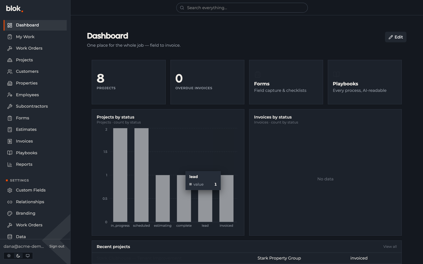
You can switch the whole app to dark now — every screen and chart, on desktop and phone — and it remembers what you picked. Handy if you're working early, late, or out of a truck, and it's a bit easier on the eyes and the battery. We went through the smaller screens too, so nothing's left as hard-to-read light-on-white.
A shared set of design pieces
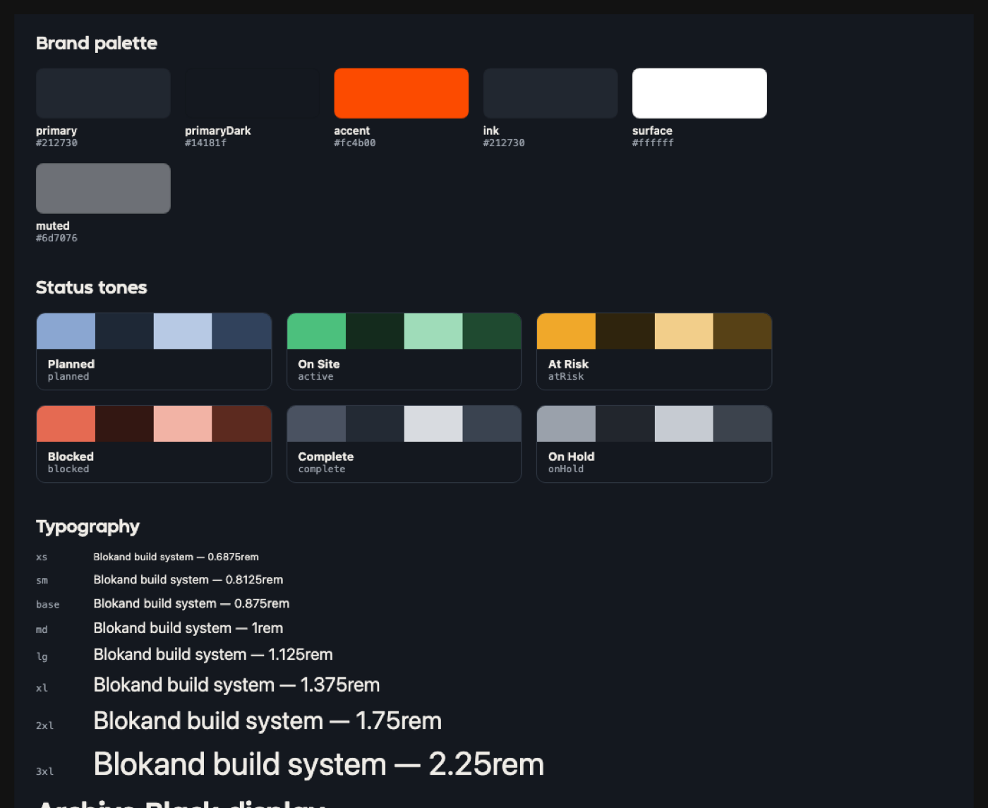
Behind the screens there's now a shared library of about 45 pieces — buttons, tables, cards, charts, calendars, form fields — each one documented on its own. Every screen pulls from the same library, so things stay consistent and the next feature is quicker to build. It works in light and dark.
Blok on a phone
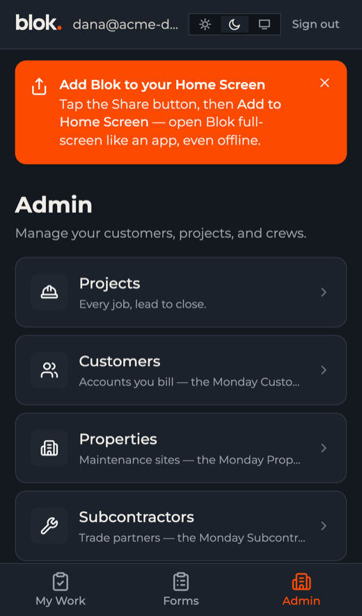
On a phone, Blok now shows a simpler layout made for the field: your work, your forms, and an admin area, with big buttons and a tab bar along the bottom. You can add it to your home screen so it opens like an app, and it keeps working with no signal.
Photos from the job site
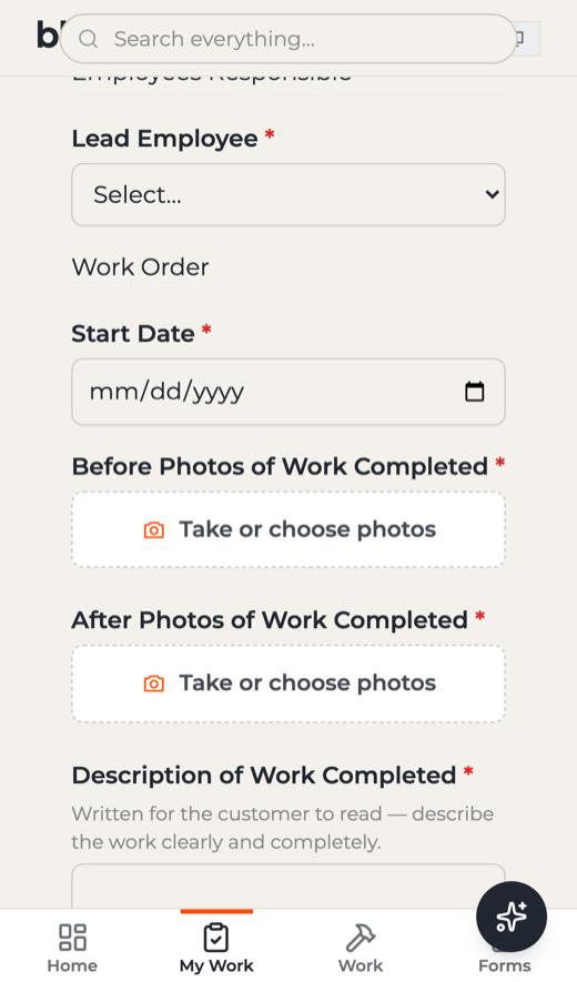
Photo fields on forms now have a clear "take or choose photos" button that opens the camera, shrinks the picture, and holds onto it until you're back in coverage. Before-and-after shots are what back up an invoice, so making them one tap on site means they actually get taken.
Billing on work orders
Work orders picked up billing. When a job is approved, Blok pulls together what's billable, prices it against your rates, and shows it right on the work order — so you're not re-typing job details into an invoice. Work orders can also carry their own instructions now: the steps, spec photos, and reference links ride along inside the form the crew is filling out, so the right way to do the job is there with the job.
The desktop view
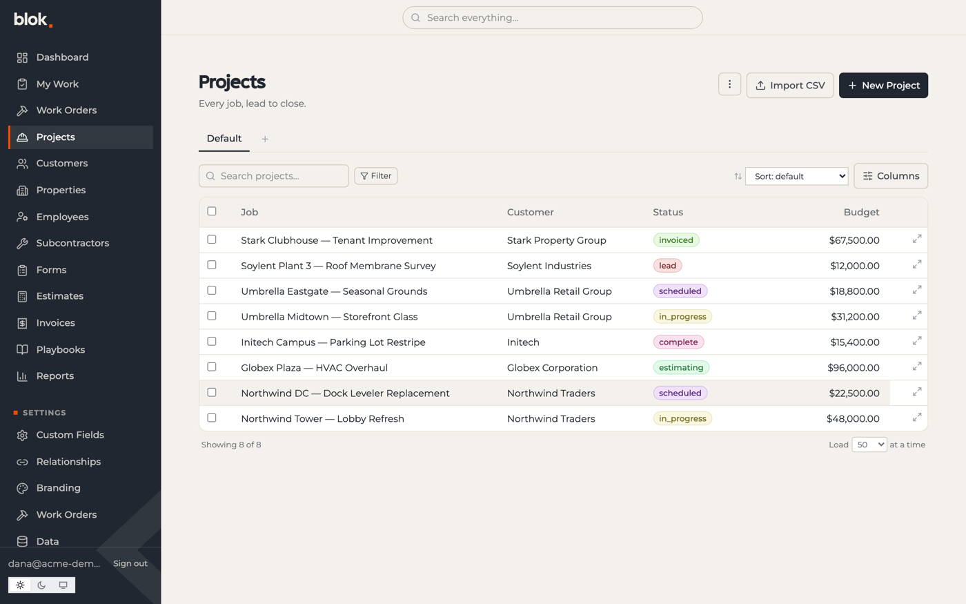
On desktop, the whole app moved into one layout: a navy sidebar, a search bar up top, and cleaner tables with color-coded status labels across projects, work orders, and customers. The office and field screens match now, instead of looking like separate tools.
Under the hood
A lot of the week went into making every screen pull from that shared library. We swapped roughly seven hundred hand-written styles for one shared set, so a change in one spot now shows up everywhere. That's what lets dark mode and custom branding work without redoing each screen by hand. Branding still holds up through all of it: a customer's own colors and name reskin the whole app, in light or dark.
Next week
- Work orders on a schedule — a shared calendar the office and field can use for dispatch, on top of the lifecycle and billing that just shipped.
- Right data for the right person — sensitive fields the office can see and the field crew can't.
- A packaged mobile app — the phone version works well now; a real installable app is next.