
Week 4: the app explains itself, boards you can group, and forms that don't lose work
This covers three weeks. Most of it was polish rather than new screens: a definition on every column, grouping and in-row editing on the boards, a submissions list you can actually search, and fills that survive a dead battery.
Every column tells you what it means
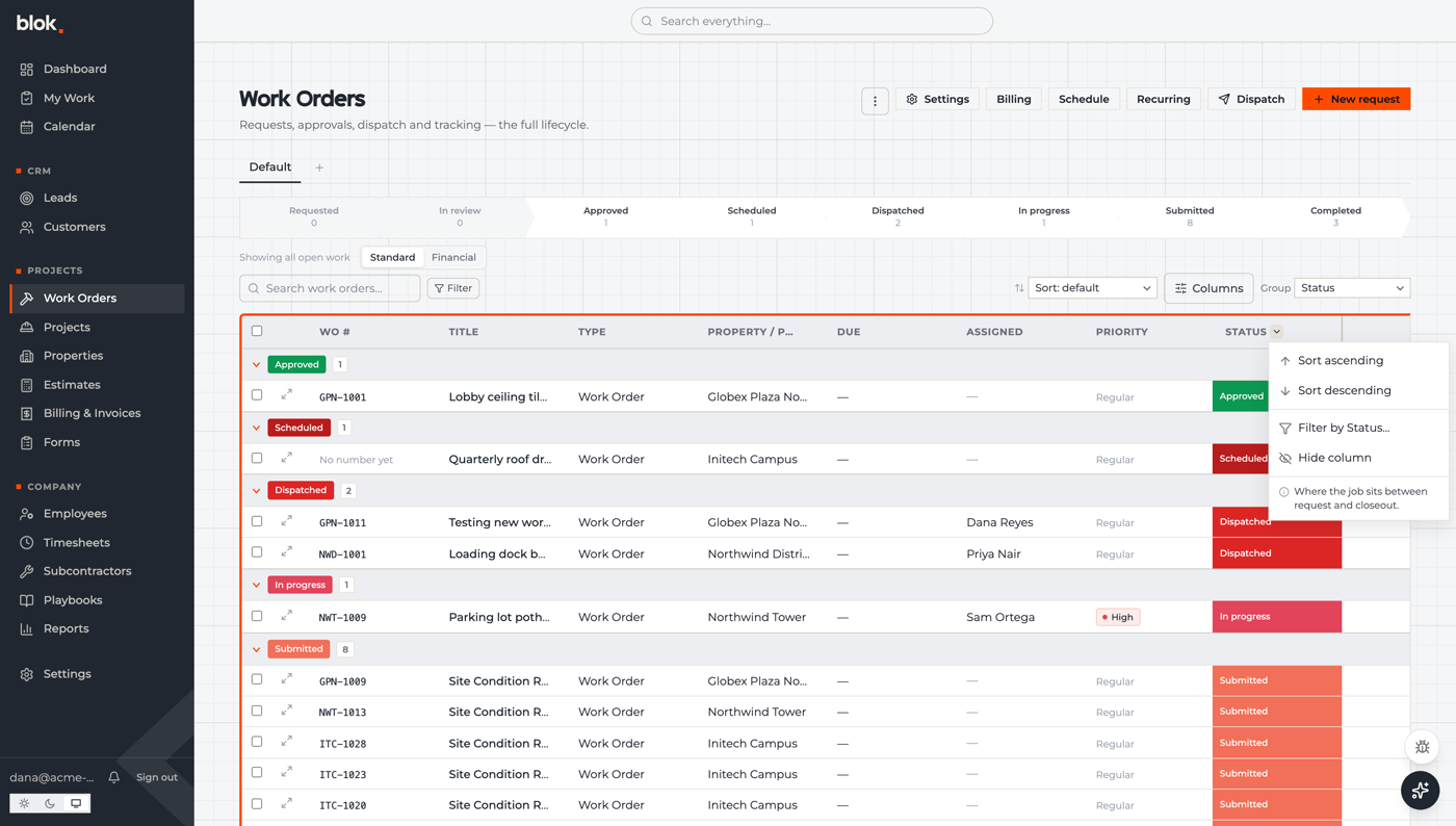
There are now 194 short definitions attached to columns and navigation items across Blok. Hover a header or open its menu and you get a sentence explaining what the field is and who uses it.
They're not hard-coded. A company can reword any of them in its own trade language, and its people see the reworded version. The same definitions feed the in-app assistant, and AI tools a customer connects to Blok can read them directly, so asking “which orders are stuck in review?” means the same thing to the software as it does to the office.
Boards you can group and edit in place
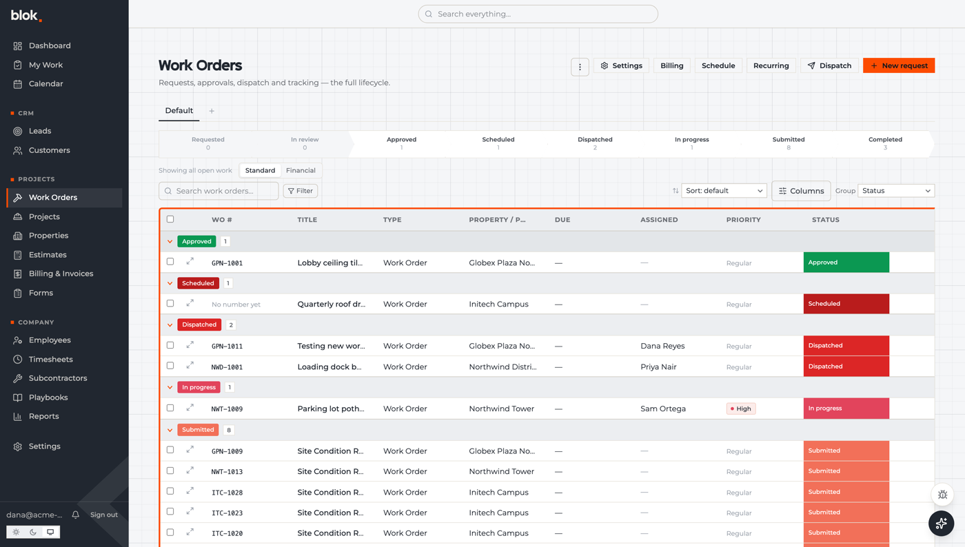
Any board can be grouped — by status, type, property or customer — with a count on each group. Grouped boards load every row, so those counts are exact. Statuses got their own colors that fill the cell, and dropdown options carry color too, so you can read a board at a glance.
Clicking a status changes it right there in the row, from a picker that says what each status means. Views can be renamed and reordered, and filters live in the page address, so sending someone the link shows them the board you're looking at.
Submissions you can search, and fills that don't lose work
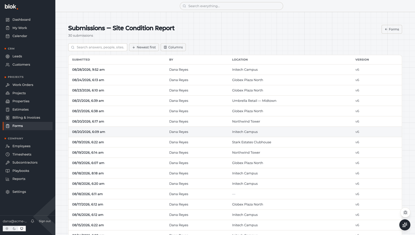
Each form now has a submissions list: search across answers, people and sites, sort it, choose which answers appear as columns, and page through with a count that matches what's really there.
On the filling side, a form in progress saves itself as the crew types. Close the tab, lose signal, or have the phone die, and the draft is waiting when you come back. That was a genuine complaint from testing and it's gone.
Work orders can't start anonymously any more
A standalone submission has to name a site, so every work order lands attached to a property instead of floating unassigned. At the other end, submitted orders can be completed straight from the board, and a completed date records when the work actually wrapped, so billing gets a real date instead of guessing from timestamps.
While a job is in progress you can see who started it and when, and the app warns you before an edit would step on a crew's active fill. Work-order settings — types, forms, numbering — moved behind a single link on the board itself.
Giving someone a login is a checkbox now
A Team page in settings lists everyone in the company, their access level, and who can actually sign in. Anyone without a login gets an invite link on their row, and creating an employee has an “invite them” checkbox in the same dialog. The invite email is Blok-branded. Onboarding a hire used to mean asking us to do it.
And when the app updates while someone has an old tab open, a banner offers a one-click refresh instead of letting them keep working on a stale version.
Under the hood
Our automated QA agent grew a proper pipeline: findings move through working-on-it, ready-for-QA and verified, and a summary lands every two days covering what's new, what's fixed and what's waiting. Approvals can come back by email reply.
On the security side, the API got rate limiting, a weaker legacy sign-in path was removed, and the web app now sends browser security headers in report-only mode so we can see violations before enforcing them.
Blok's own documentation moved out of the customer playbook system into a docs site that versions with the app. Playbooks stay what they should be: the customer's operations manual, not ours.
Three weeks of QA fixes are folded in here too. Empty screens explain what the page is for instead of showing nothing. Dialogs and charts use the company's own words for types and statuses. Phone cards get click-to-call and click-to-email. My Work sections with ten or more items collapse to a count instead of a wall. Phones get a read-only dashboard with a per-card show and hide. Edits apply immediately instead of waiting for a page reload.
Next week
- One dropdown everywhere — replacing the last browser-default menus with our own.
- The corner bolt — a small brand detail applied across cards, dialogs and dashboard widgets.
- Phone dashboard — deciding how much of it should work on a phone, then building that.